Basic temporal information can overlaid visually on a transit map and there are ways this can be done that might be useful. Here, I describe the idea, enumerate some of its possible variations and give some basic examples that should illustrate its potential value. Factors such as ease of use and accessibility are of primary concern and are addressed.
Table of contents
Background
In one of Reece Martin’s recent videos (which is very good, watch it here) he ends with questions about how we should go about communicating transit times in simple ways to passengers. In this context he’s talking specifically about travel times across connecting lines, but this has general value outside of this as well.
I assume many people have had this idea before, but I can’t find anything exactly about my prescription after a few Google searches and GPT conversations.
The Diagram
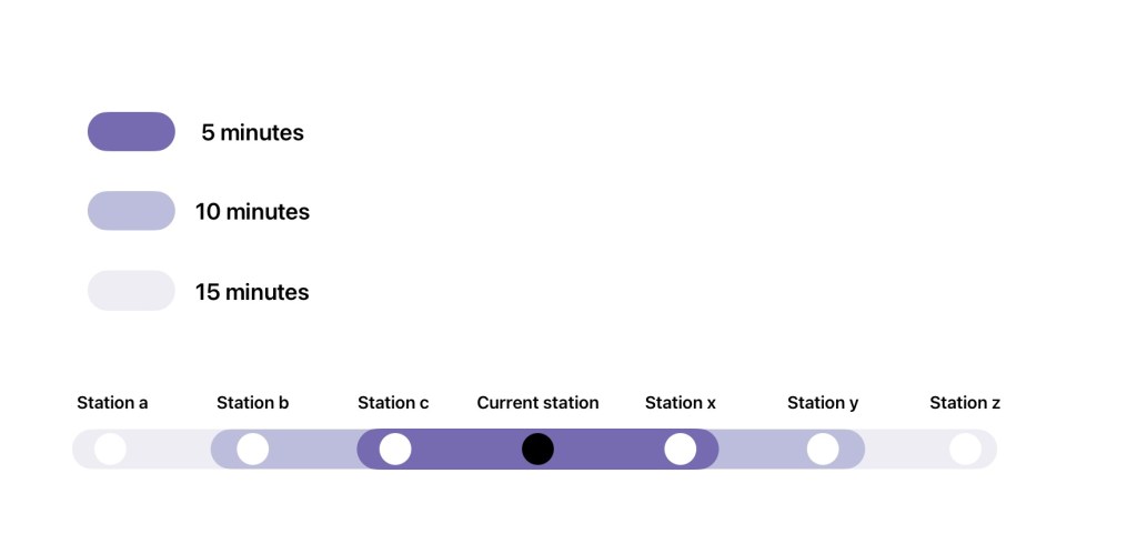
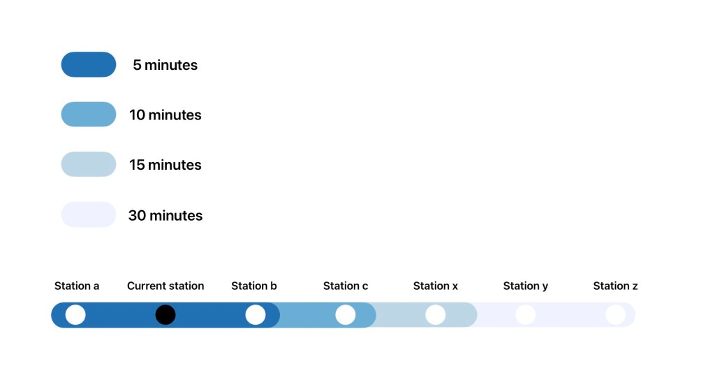
I propose that a transit station or vehicle displays its usual system map but with an overlay of colour or visual pattern which corresponds to the maximum time to reach each other station from the current position. The position is the station if it is placed in a transit station or if the vehicle is at a station, and simply the point at the network it is in when the vehicle is in motion. Here are some various possible forms this could take:
Live updating
Static versions might suffice for modes less prone to delays as a “best case scenario” where you can at least compare when two lines would be scheduled to get you to a given station if they are both on time. However, this leaves a lot on the table and limits the utility of this type of diagram.
The diagram would probably be more useful if it is implemented using a display which can update the visual coding based on current delays etc. Modern metro vehicle systems already have sufficient information to make the simple calculation and update the display.
Accessibility
It is desirable to have the benefits of such a system accessible to all, even though the information isn’t essential, per se. Most pressingly, using colour to convey information will never be fully accessible even among sighted people because some are colour blind. At the same time, it seems to be the ideal mode for people with typical colour perception and sight. Accessibility is a complicated thing I won’t pretend to fully understand, but I will still enumerate the potential mitigating solutions I can think of.
Use colour as the method of delineation but choose the colours to be more likely to be visually discernible by people across the visual ability spectrum. This has already been pretty much figured out – see [1], which is what I based the single-hue colour palette choices on. The reader can try putting any of the above views into a simulator such as [2].
Use a non-colour based visual system, such as a hashing pattern or breaking of the line. I would be interested to see if anyone can come up with some visual concepts which would make this possible.
References
